As a kid I was incredibly anal about handling the packaging my games came in. Growing up before there were CD/DVD cases most games — in particular anything for a Nintendo system — were packaged in relatively flimsy cardboard boxes. I took great pains to carefully remove the tape sealing the box; making sure to avoid tearing any of the package along with it. I even made sure to open the box in a gentle way to prevent creasing in the thin cardboard. Opening the game was a ritual of sorts, acquiring a new game was a relative rarity as a child and I made sure to savor every step of the process. Delaying the time until I could jam the cartridge into my console through meticulous unpacking was part of the experience.
As this and many similar stories can attest: packaging matters. It’s often the very first way people are informed about any product (including games). It’s why companies like Apple spend inordinate amounts of time and attention to simple details like the texture of the box. Apple’s packaging is so good that it is not uncommon for people to use it as decoration.
But even the fervor of Mac fans could probably not hold a candle to the nostalgia associated with videogame packaging. Today modern game packaging is at best perfunctory and at times now nonexistent. But games from yesteryear took great care in making sure the box wasn’t a just another barrier to the game, but a potent experience by itself.

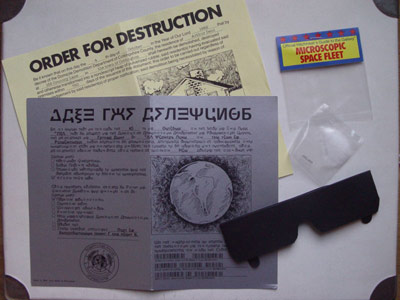
No where was this more evident in the lengths adventure game companies back in the 1980s went through. Partially to compensate for the low-fidelity of the text games themselves and partially to invoke the first steps in universe building, companies went the extra mile in jamming boxes and other unusual containers with maps, hidden messages, and other treats. Infocom became legendary for the amount and creativity of their trinkets. Loving dubbed “feelies” they included items such as a “magick glowing stone” for Wishbringer or “peril sensitive sunglasses” for The Hitchhiker’s Guide to the Galaxy (a pair of shades with no eye holes). The entire packaging history of Infocom can be seen at this amazing tribute gallery.
But the unique packaging of games from publishers like Infocom or Origin are now obsolete. Original packaging is expensive to manufacture and cumbersome for warehouses and stores to handle. The demands of shelf space are now at a premium with the death of smaller game stores in lieu of big box retailers. And the truth is that most consumers simply can’t be bothered to care about anything inside a box besides the game. Even the manual has become superfluous as most companies have gone from color to black–and–white to a single sheet of instructions along with a website address.
Microsoft is among the worst offenders in this decline of game packaging. Microsoft in any of their marketing efforts has always lagged behind standard bearers (as famously mocked in-house) and their Xbox–related efforts have not shown much improvement. Even when dealing with things that should be relatively standard Microsoft has managed to screw up. First was the Halo 3 Collector’s Edition tin which had such flimsy design that the DVD was more likely to not be in place upon opening then it was to be in place. And now we have this.

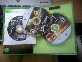
Yes, you are seeing right. Lost Odyssey is a monster of a game weighing in at 4 DVDs necessary for all that high–definition video and music. But Microsoft’s North American division has perhaps gone the laziest of all possible routes to fitting every disc into the case. That’s three stacked DVDs on top of each other in the spindle. And to top it off you have the fourth DVD in a paper sleeve on the side. It screams cheap especially when our European brethren at least got a proper 4–DVD case.
Again, packaging is important because first impressions are important. Your first thought when opening this monstrosity isn’t a positive one. You’re left thinking, “Who the hell thought of this?” Even in this era of disposable boxes and cases I like to think that consumers still care about the little details. If we didn’t why people complain about terrible box art? It’s hyperbole to call the case for Lost Odyssey a disgrace. But it leaves an impression and in a world where people can be turned off products for the most minuscule of reasons it seems a bit thoughtless for a corporation like Microsoft to let this slip.
Leave a Reply